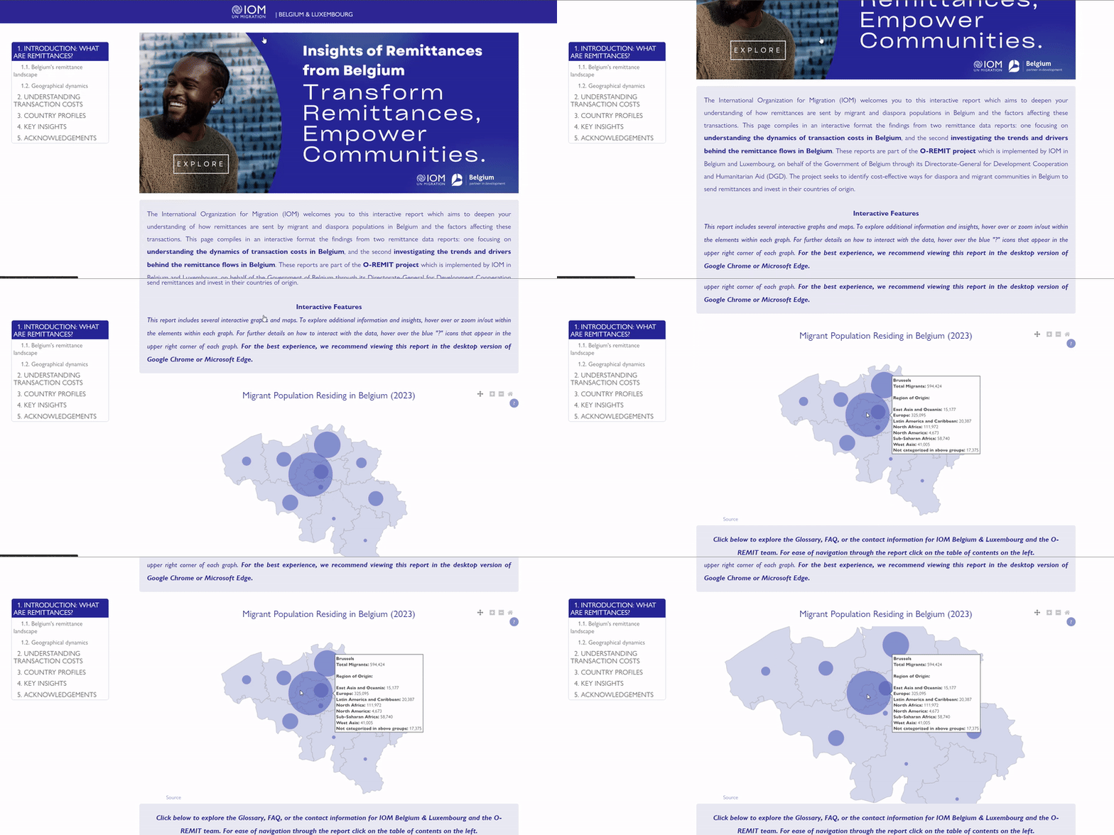
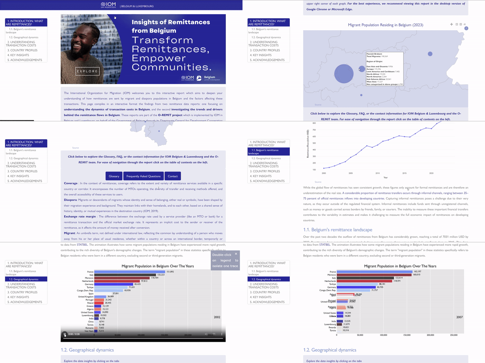
As part of my consultancy work for the UN Migration Belgium and Luxembourg the report allows users to explore data interactively, displaying graphs and visualizations that make the insights clear and accessible. This analysis builds on two earlier studies, one being a market analysis and another a report where I applied advanced statistical methods—specifically, a two-step Generalized Method of Moments (GMM) with instrumental variables (IV)—to investigate cause-and-effect relationships within Belgium's remittance market. To ensure accuracy and efficiency, I constructed a comprehensive database and established an ETL process to manage and integrate the data effectively.
The primary goal of the interactive report is to provide stakeholders with a clearer understanding of remittance market dynamics in Belgium. By allowing users to explore data interactively, the report is designed to enhance decision-making processes and facilitate more targeted interventions in the market:

In generating this interactive report, I leveraged a range of technical tools and frameworks, including Pandas, NumPy, Seaborn, Plotly (express, graph_objects, subplots), Bar Chart Race, GeoPandas, Pretty Jupyter, Jinja, HTML, and CSS. One of the main challenges was estimating missing data with regards to corridor level remittance flows, which I addressed employing the methodology of the World Bank for estimating bilateral remittance flows. This approach allowed for a more complete and reliable analysis, despite data limitations in the remittance landscape in Belgium.
This interactive format offers several advantages compared to traditional reports:
| Feature | Traditional Report | Interactive Report |
|---|---|---|
| Data Exploration | Static, limited to pre-defined sections | Dynamic, allowing users to explore specific data points, filter information, and interact with the visualizations |
| Visualizations | Static charts and tables | Interactive charts with real-time filtering, zooming, and animation options |
| User Engagement | Passive reading of content | Active engagement with data through hover features, clickable elements, and more |
| Accessibility | Print or PDF formats | Accessible across multiple devices, with optimized web performance |
| Depth of Analysis | Generalized for all audiences | Allows deeper, personalized analysis, specific to user needs |
| Didactic Experience | Limited to a static narrative | Interactive and self-paced learning through visual and data interaction |
This interactive format provides a more layered view of the data, offering an engaging experience that enhances both comprehension and exploration. Below, you can find a short preview of how the report's interactive functionalities, making the information more intuitive and accessible for all stakeholders:
